I am so sorry for the TERRIBLE layout of this blog! It was actually pretty nice but one day everything went all amuck ??? No clue what happened....and since I don't really post here anymore I haven't bothered to figure it out. SORRY!!!

Friday, February 25, 2011

Faux Japanese Tape

(this is a copy of something I wrote last year on a different blog...so the pictures of samples are PRE-new camera...sorry!)


Yesterday I woke up to an email from my sweet niece, Mattie, introducing me to Japanese Masking Tape.  OMG!!!  I fell in love instantly so I spent the next two hours shopping the internet for different colors and things to do with it.  I "spent" almost $200 and didn't have all I wanted....and thankfully, I never pushed the final "pay" button!!!  That's a LOT of masking tape... and I was having a hard time thinking about what *I* would do with it.  There were some cute things but... $200!!!


This time...one of the RARE times, I waited a while before actually buying anything.  Later in the day I thought that printing on clear label paper may work.  It is sticky on one side and I can do ANY color almost instantly.  There are pros and cons but... $200!!!

So, here you go...here are some pictures of actual tape and some of the patterns I came up with...I didn't try to match but they are in the same color families so I'm showing them together...

To get your FREEBIE you can click on my version to enlarge it then right click/save.


Here is an example of one of the problems with the clear label sheet...(sorry for the HORRIBLE picture!)  Below you can see by the bottom grid, it is see thru...so white isn't white unless you put it on white.  So, I put it onto white tape for the top version... fixes the problem, but adds a step.  I kinda like the two together.

One cool thing about the way I laid it out on the paper is that I can cut a strip across the "grain" and get multiple patterns or up and down to get a single pattern.  Examples of both below:

What I did with it: (again, sorry for the bad picture, it's getting dark here)
This is a VERY EASY way to match my envelopes and cards without having to print directly to the envelope!  I probably couldn't do that as easily with tape because the colors wouldn't be exact.  BUT, I will be buying some that I "just HAVE TO HAVE"! :-)
OH! and FYI, I had to eat vegetable soup for lunch so I would have a can to make the pencil holder! ... the sacrifices we make for our art...
Thanks  for the inspiration  Mattie!  I LOVE YOU!


Linked to:
Santasgiftshoppe


Funky Junk's Saturday Nite Special

Thursday, February 24, 2011

How To Intertwine a Monogram


I have always LOVED the look of a monogram where two letters intertwine.  I have a stamp of my initials together that I bought 20 years ago!  I bought machine embroidery patterns that will put the one on top of the other (but not "intertwined"). I have several fonts that are built to be layered but not "intertwined".  FINALLY, today I had a WELL DUH moment when it suddenly occurred to me that I just need to use layers and erase part of the layer of one letter.  HELLLLLLLOOOOO.....Yes, I'm a little slow getting there, but hey!  I finally did get it!


Here ya go:


This font is called "Museum Initials". ($12)  BUT WAIT!!!  Before you think about buying it I just found almost the same EXACT font called Burgoyne Initials for FREE at DaFont.com  .... Feeling kinda stupid now!

They start out looking like this:


To combine: 
(sorry, I tried to print screens but I'm having PC issues!)

1.Using a photo editing program, like CorelDraw or PSE,  you want to put each letter on separate layers.

2. Each letter needs to be filled with desired color (my choice was white)...because even though it looks like the letter is "filled" it really isn't, its transparent and you don't want that...you want the INSIDE of the letters to have color but the OUTSIDE of the letter to be transparent.

3. Move one of the letters on top of the other


4. Change the size of each to your liking... I stretched the B taller and made the N wider

5. Now erase the part of the top letter that you want to appear to be BEHIND the other letter...that will let that portion of the bottom letter to show through and that portion will appear to be on top. On my NB I just erased the very small portion on the top left of the N.... that's it!  (now on this one it is kinda cool that the ring around the middle of the N really kind of looks like the middle of the B - I like that)

5. I then flattened the two together and saved them as a .png file. As a .png the background stays transparent and I will be able to add it to other pictures without a big white box around it!... 


like HERE ... I modified this one a lot because I needed for it to fit onto something.

All images are modified versions of  FREE files from The Graphics Fairy (LOVE THAT SITE!)


Another  MUCH EASIER option is to use MFC Sappho Monogram Font  ($29.95) that looks like this:
All the work is done for you!  All you need to do is type one letter in lower case and the other in uppercase,  DONE!!!  How cool is that?!  However, (there's always a however) it is an OPENTYPE font  NOT TrueType so it only works with Adobe software like PhotoShop or PS Elements, it will NOT work in Word or CorelDraw, etc.


Be sure and check out all of Brian's other monogram fonts while you are there ... I have almost all of them!  LOVE!


Linked to:


lThe Graphics Fairy

Monday, February 21, 2011

Printing on Fabric


If you want to print onto fabric there is no need for all that expensive "printable" fabric!  Most any tight weave fabric can be used....I'm just not really sure how thick it can be... I've tried some that I thought for sure would not make it ... but it did :-)  ... All you will need is something to make the fabric stiff enough to go through the printer...There are some products that are made just for that purpose, but I just use what I have TONS of and that is full sheet label paper.  (I have also used freezer paper that I ironed onto the back of the fabric then cut that to a size that would fit in the printer.)


STEPS :
  1. Pull the back protective paper off of the "label" and stick the "label" down on the fabric.  
  2. Cut the fabric out around the full sheet so that you now have an 8.5"x11" piece of fabric ready for printing.
  3. Print using normal settings on an ink jet printer. (BUT do it at your own risk!  It works on my Kodak printer, but I'm not guaranteeing anything!)
  4. Take the label paper off.
If you are going to appliqué it onto something (that doesn't need washing, because I'm not certain how well it will wash) 
  1. Iron something like "Stitch-Witchery" onto the back of the printed fabric
  2. Cut the design out if that's the look you are going for.
  3. Peal backing of "Stitch-Witchery" off
  4. Iron the design down onto whatever you are using 
  5. Machine Zig-Zag around the edge of the design.
Here is something that I printed last night then added to a canvas bag that I had lying around:


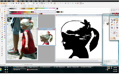
I used a silhouette .jpg  that I created last year using this original of Kamryn, my little niece:


Pretty cool huh? :-)  I just LOVE that picture of her!

I then added a FREE frame from "The Graphics Fairy".  


If you want to read the whole "WELL DUH!"  silhouette creation story it is HERE.  I wrote it last year on a different blog. My "watching Nancy learn blog" (that was a fun one for sure!)

P.S.  I usually get my label paper HERE at Online Labels.com.


Sunday, February 20, 2011

Eye Chart

OH MY GOODNESS!!!  There is a website for EVERYTHING now!  Check this one out!  I love it!  You can create your own eye chart... type your phrase in and it creates an eye chart from it!


Now all that's left is making something from it!  Hummmm???

Saturday, February 19, 2011

Silhouettes from photos...

(this is a repost of a blog I wrote last year on another blog)
.
Night before last I was given a new challenge....to create a silhouette from a photo of a couple hugging.  I won't say who challenged me because its for a gift and you just never know who might read this stuff!    My reply was "Sure I can!"    With that ever present " I can do ALL THINGS through Christ..." attitude.  HA!


Of course, being the age I am (50+) my first thought was to use Corel Paint, black out the important parts, erase everything else, print out onto black paper and cut the printed part out.... with tiny scissors.  That is, after all, how you do it right?!  So, that's what I do... I print black on black, perfect!, easy enough to see and cut.  No, I didn't cut it, I was going to let her do that. :-)


She had told me that there were lots of shops on Etsy that sold them so I went there to check it out.   They are using vinyl!!!  DER!!!   OK, feeling really stupid now. Do I have a vinyl cutter right in front of my face?!  YES!  So, I did what I do to cut vinyl and TA DA! ... Silhouettes from photos...


 Be watching for my new shop in your Etsy neighborhood! :-)


Steps...
  1. Copy/Paste a picture from a facebook album
  2. Crop to the head or, use the whole body like I did for the couple
  3. Change to b/w and putz with that until you are happy
  4. Cut out using a vinyl cutter!


Sorry, I can't figure out how to turn the flash off! BAD GLARE!!!  And it's all bent up because I was trying to "weed" it on the machine...not easy!


Lessons learned:

  • A PERFECT profile picture is best, otherwise the hair becomes part of the nose, making it look HUGE.

  • The more dpi the better.  This one was 72 dpi so it was very pixelly, I had to convert it to 300 and mess with it UGH!

  • The Lighting is important ... too dark is hard.

  • Need a good contrasting background

  • The best picture would probably be one made just for the silhouette, not for the picture...no extra "stuff"
Now OFF!  I have to do SOMETHING to make some $$$!

PS.  Thanks for the challenge! ;-)

One of the things I made from the .jpg file I created: 

.

Friday, February 11, 2011

Candy in a Bottle


I don't drink beer so I had to buy my bottles from a local Home Brewery Supply store.  BUT, I may be checking out some local bars for their throw aways soon :-)!  Maybe... I kinda like not having to deal with removing labels and beer smell!  If you are like me, I have a link below that can help you out with supplies.  

As you can see, I filled the bottles with candy.  LOVE! LOVE! the look BUT... it takes a minimum of  $2 worth of candy to fill it up!  NOT CHEAP! (if you want to give one to everyone you know!) so I'm thinking everyone will be getting a MESSAGE in a bottle!  

At first I was kinda bummed out that they didn't have any clear bottles but I've decided that I LOVE the brown because you can put any color candy and no one can really tell... so, I don't have to worry about matching the "holiday color".


The label is from  "The Graphics Fairy" site ... check out all the FREE vintage clipart!  AMAZING!

I modified a label from Cathe Holden for the hang tag.


Linked to:
Funky Junk Interiors
The Graphics Fairy
Photobucket

Thursday, February 3, 2011

Zentangle ???

OK, so where have I been the last two years!!!  I can not believe that there is an "art" out there that I haven't had a CLUE about!  It is called Zentangle and TONS of people are doing it!  To the left is a VERY, VERY PITIFUL, 10 minute to make, example of what I'm talking about.  But, in all fairness to me, I had an idea and picked up a PEN to try and draw a prototype of the idea!!!  I AM NOT an artist, so we are talking boldness here!  Kinda hard to tell but the black part was suppose to look like a zipper...kinda hard to show when everything is black on the zipper.  Anyway, you get the point...
The zentangle part is all the stuff below the heart, if you google the word you can see REAL ART!  I'll get better one day because it really takes no talent, its just doodling!  I LOVE the look of it!  Probably because 99% of all pieces is totally black and white..my favorite. Below are a few books that might help you doodle:

. .


Wednesday, February 2, 2011

PaperbackSwap.com

Back in the late 80s and 90s Leisure Arts published some of the most beautiful "craft/recipe" books ever! It was a series of "Gifts that Taste Good".  Every page had a beautiful color picture of food packaged with CLEVER gift packaging with instructions on making both the food and package yourself.  BEAUTIFUL!   
Here are a couple of the covers:

After that series they started another called "The Spirit of Christmas"...each of those would show a room decorated  for Christmas with handmade items and they would give you instructions for each thing.  I LOVED THOSE BOOKS!!  And I had them all....until my house burned down in 1999... all gone.

BUT, I found 5 of the series at Trade Books for Free - PaperBack Swap. and I have already gotten 4 of them!!!  All in PERFECT condition! My collection starts again...I am so excited!

Listen, if you haven't discovered Paper Back Swap, you REALLY NEED to check it out!  It is an AWESOME site!  Basically, you get a "credit" for every book you swap and it only cost the shipping you pay for the book you send to someone else.  It cost ZERO when you order a book!!  And, it isn't just paperbacks, all the books I got are hard cover.

Get a playlist! Standalone player Get Ringtones